Introducing the New Rider App

We designed the new agency-branded Rider App with our users in mind. It is packed full of information public transit riders need to get them quickly and easily from point A to point B. The app allows users to easily access real-time arrival and departure information at nearby stops and routes, receive updates on the latest service alerts, find more information from their local transit agency, and even save their favorite routes to make the next trip easier.
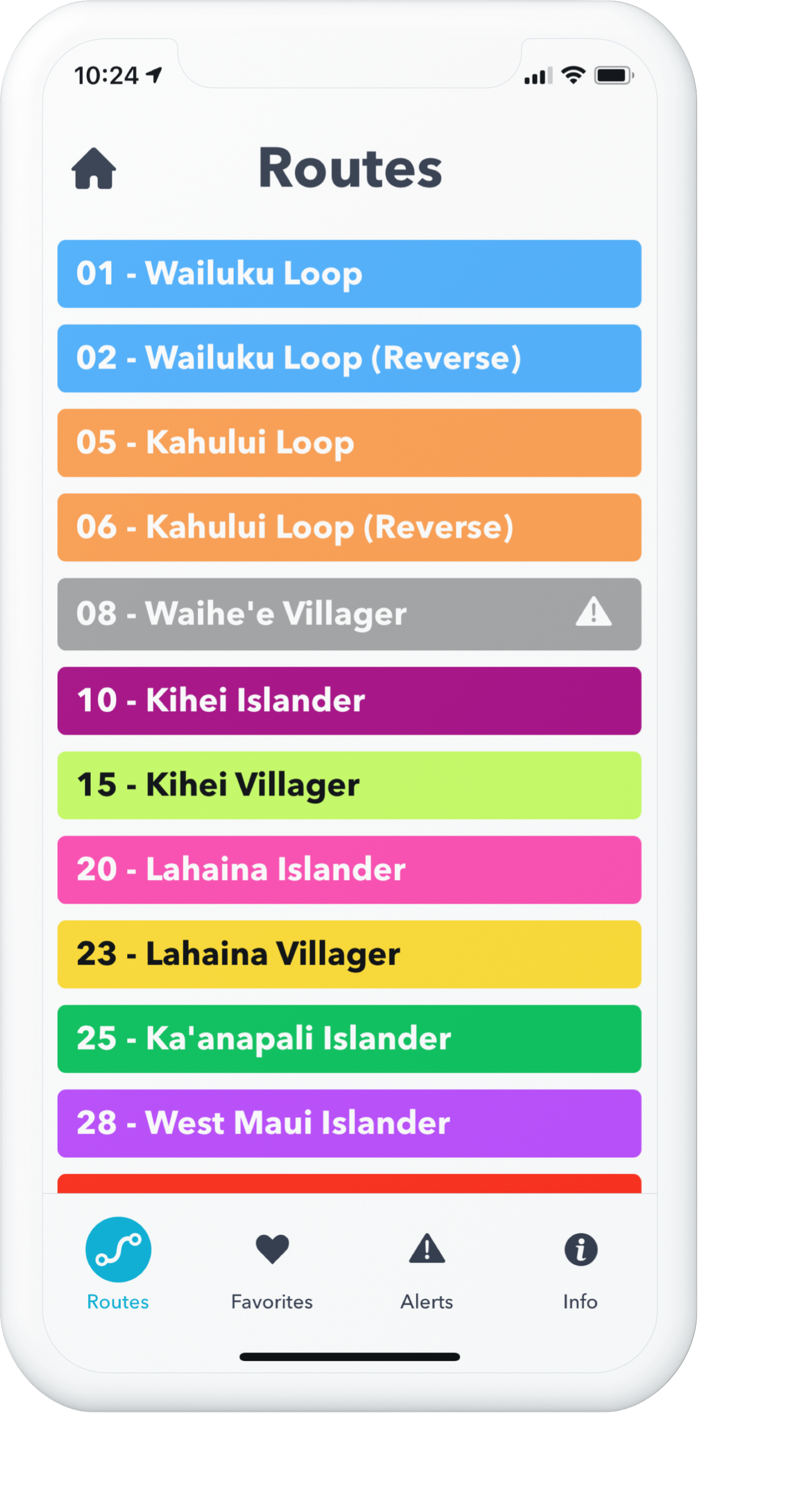
Bold colors and text allow riders to find route and stop information quickly and conveniently.
To create a successful new product, it takes a small army of product managers, designers, and developers all working together. It also takes plenty of participation and feedback from our users. We’ve taken that user feedback – and some creative license – and designed a brand-new interface for the Rider App. This new experience will allow users to digest information about their surroundings in a simpler way.
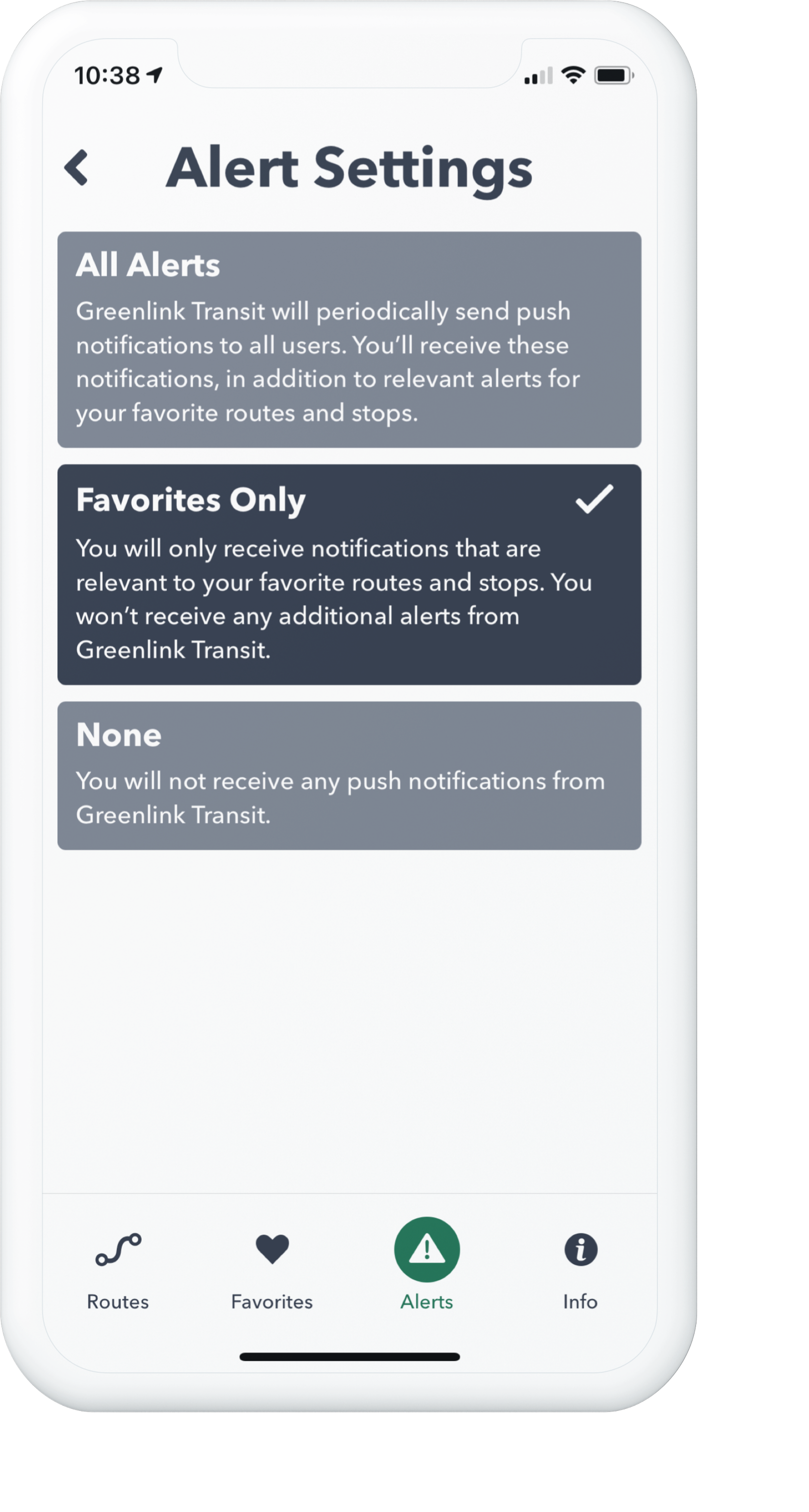
We’ve also taken alerts to the next level by providing additional context. Users will receive more personalized alerts based on their app preferences and favorites, making information in the app more meaningful. This method of giving users proactive and contextualized alerts has always been a key tenet of our Dispatch software, and the new Rider App brings the same philosophy to our rider-facing product.
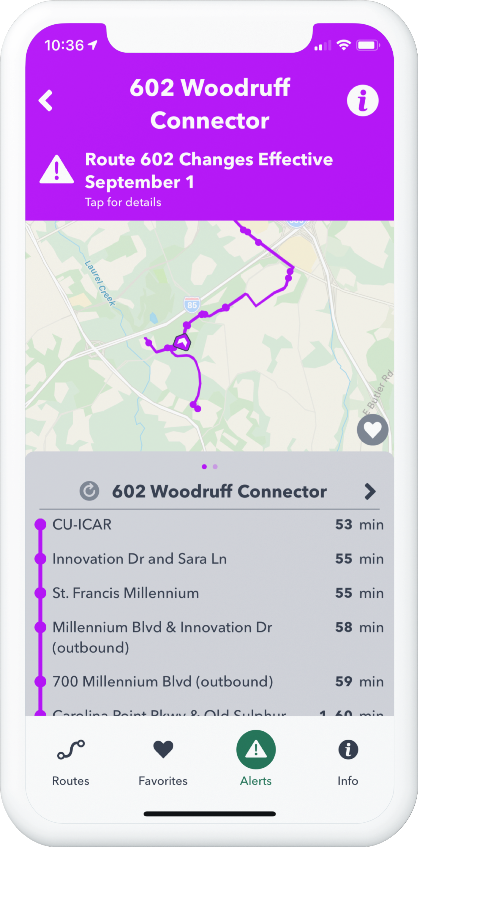
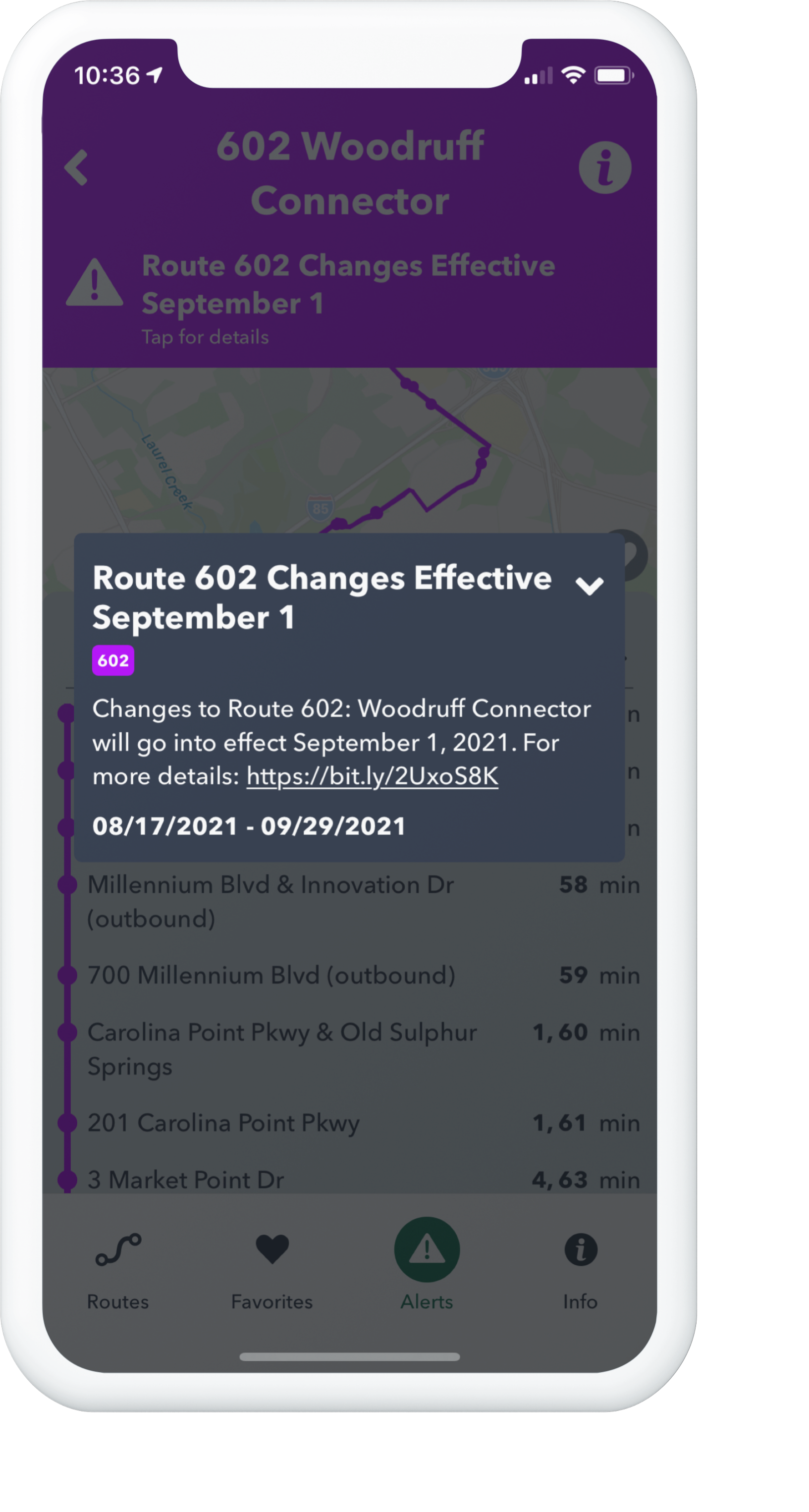
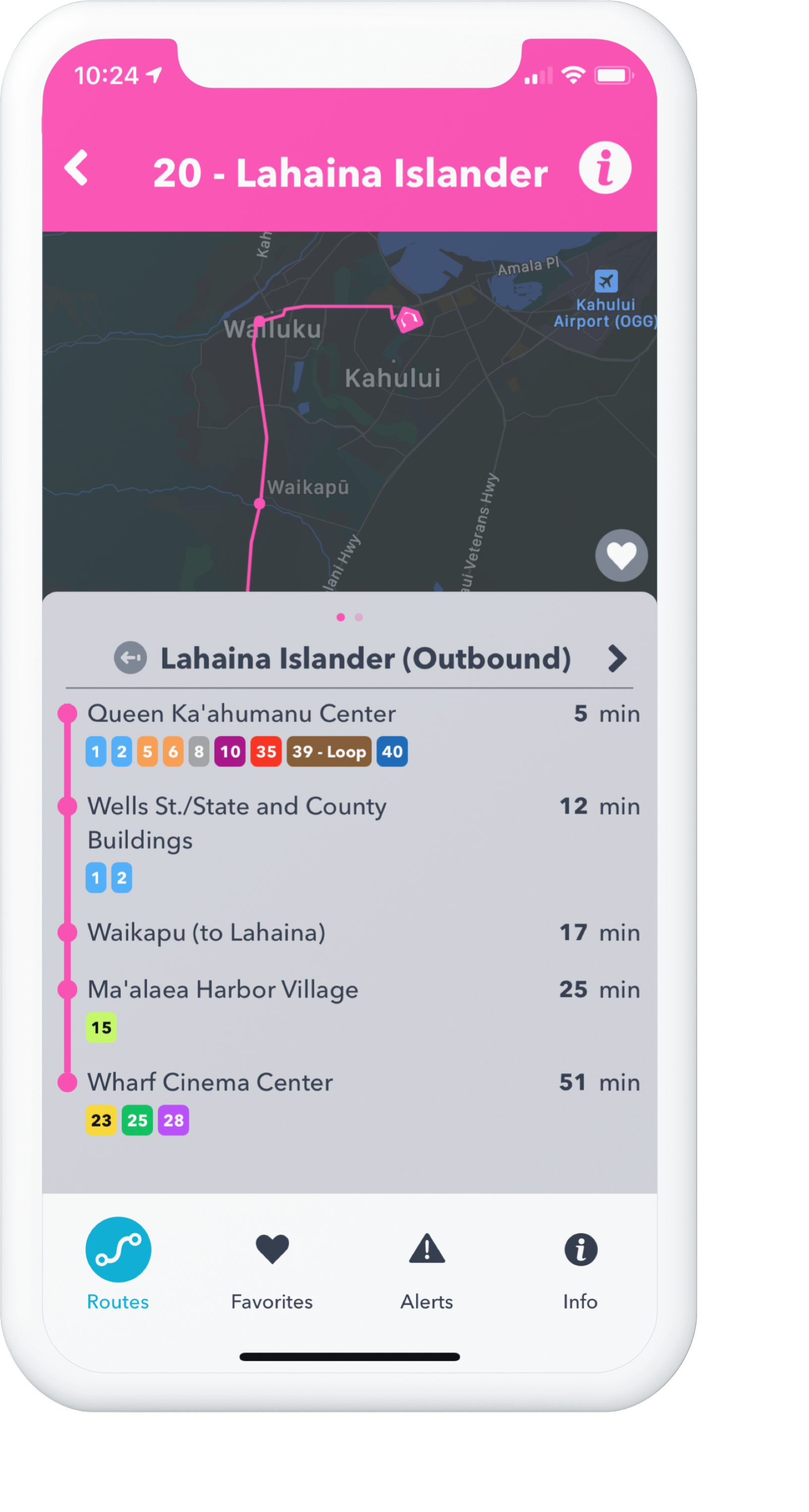
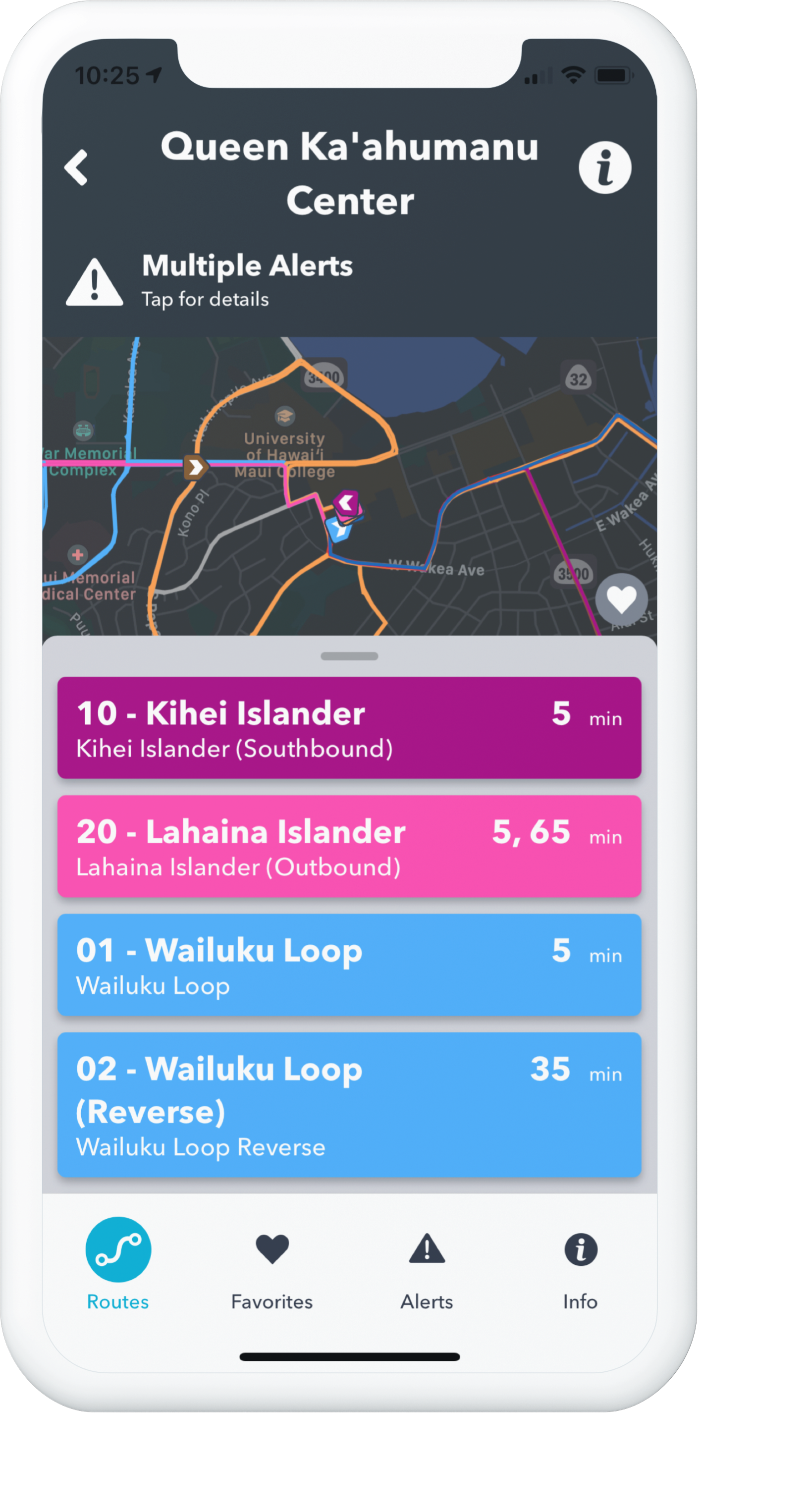
Riders choose which alerts to receive as push notifications, and alerts appear in context with routes and stops.
In order to create a convenient experience for all of our users, we purposefully designed the app utilizing best practices for accessibility. The new navigation bar at the bottom of the screen is more easily accessible when holding the device. Bigger and bolder text allows users to more quickly read and understand information. We increased the size of the touch targets on screen, which allows users to interact with every part of the app efficiently.

The Rider App also supports dark mode on iOS, allowing even more user personalization.
We also wrote the app specifically to work with native screen readers on both Android and iOS, giving users who are blind or visually impaired an app experience that better fits their needs.
Accessibility features are built into the app at every level.
All of these enhancements ease the pressure of discovery on the user and simply place the most important information in the forefront.
Customization and branding features built into our agency-facing product allow our customer marketing and communication teams to configure the app’s logos, colors, and other information to reflect their brand. We believe that riders should never see the name of our company, and that the Rider App should help build a relationship directly between the rider and the transit agency.
The new Rider App, with all of its new features and thoughtful design, is now available. If you’re interested in delivering a new iOS and Android app to your riders, contact us today!